
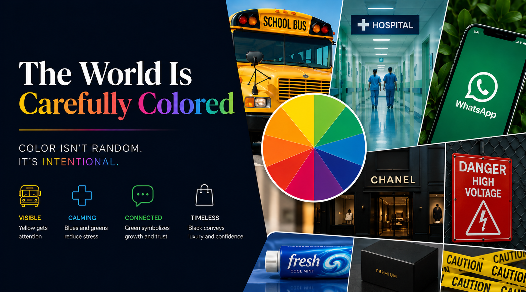
At Skreed we think about colors a lot. Not just about which colors look good together but why some colors make us feel a certain way. Why does blue make us feel calm? Why does yellow invoke a sense of joy? Why do luxury brands usually use black? The deeper we looked, the more we realized that color is the world's most powerful design tool, and it's quietly shaping our decisions every single day.
The World Is Carefully Colored
Take a look around you. School buses are yellow because they’re easier to spot. Hospitals use blues and greens because they're calming and reduce visual fatigue. Messaging apps lean on green because it represents connection and growth. Luxury brands rely on black because it conveys confidence and timelessness.
Color is always intentional. Each of these colors were chosen to communicate something before a single word was read. Once a color proves it works, it becomes part of our collective memory. We don't exactly question why toothpaste is usually blue, why warning signs are yellow or red, or why a matte black box feels more premium than a bright pink one. These choices become so familiar that they stop feeling like design altogether.
That's Why We Built Skreed Differently
Most case brands treat color like the final decision in the design process. Pick a few safe shades, add a seasonal color or two, and call it a collection. We started from the opposite direction, and led with color. At Skreed, color isn’t an afterthought, but the entire experience.
A phone is one of the few things we carry almost everywhere. It sits on our desk, in our pocket, beside our bed, and in our hands for hours every day. The color wrapped around it becomes part of our everyday lives. It deserves more than the same five colors everyone else is choosing. That's why we built a palette of 240 shades.
Everyone has certain colors they gravitate towards. The faded blue of your favorite pair of jeans. The green that reminds you of weekend hikes. The warm beige that makes every space feel calmer. They're small preferences, but they're deeply personal.
Look a Little Closer
The next time you're walking through a supermarket, waiting at a traffic light, or opening your favorite app, pay attention to the colors around you. You'll start to notice that almost nothing is colored by chance. Every shade has a purpose, every palette tells a story.
Ask yourself one question: Why is it that the object you use more than almost anything else in your life comes in such few colors?
We're surrounded by endless choice. Paint comes in thousands of shades. Sneakers are released in new colors every week. Even water tumblers have become a way to show personality (we're looking at you, Stanley cups). But phone cases, something we look at hundreds of times a day, are still expected to be black, clear, or navy.
We never understood that. That's why Skreed exists.
Color is such a simple yet powerful tool of self expression. We wanted choosing a phone case to feel less like settling for whatever was available, and more like finding a shade that genuinely feels like you. That's what inspired our Classics Collection of 240 carefully curated shades across 10 color families, designed to give color the attention it deserves.
Share:
The Paradox of Choice: Why More Options Feel Worse...Until They Don't