Colors tell stories, shape emotions, and often define whole eras. Some shades become so closely tied to a feeling or a moment in time that they become part of pop culture.
From the soft pastels that dominated Instagram feeds, to the minimalist beige that took over modern homes’ aesthetic, or the calming sage green that symbolizes wellness, some shades have become icons in their own right. Here’s how three such shades conquered the internet, and why we’re still obsessed with them.
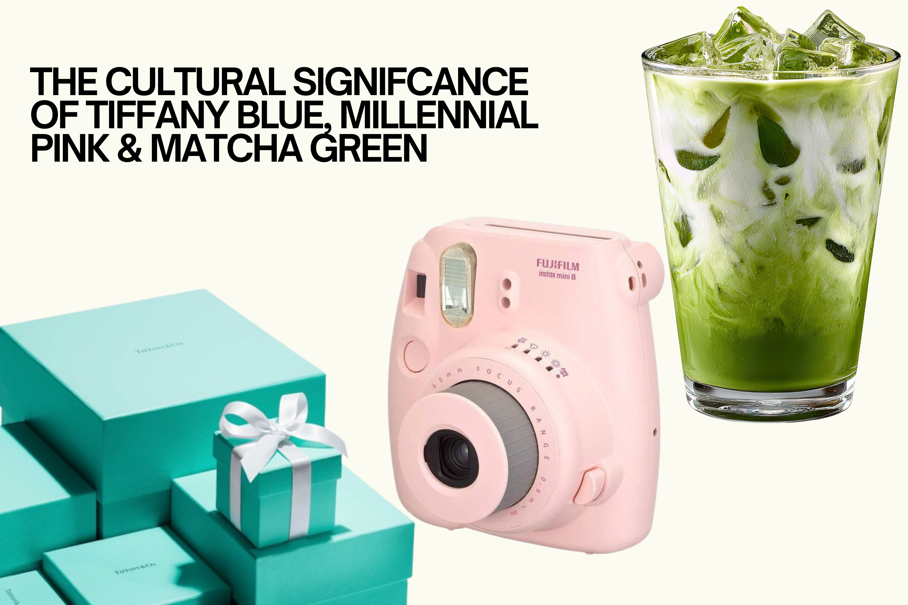
Why Millennial Pink Took Over the Internet
Long before it had a name, the soft peachy blush now known as "Millennial Pink" was quietly making its way into fashion, interiors, and design. Around the mid-2010s, the color burst in popularity, appearing everywhere from coffee shops and sneakers to smartphone accessories and social media feeds.
Unlike the bright, stereotypical pinks of previous decades, Millennial Pink was subtle and gender-neutral. Somewhere between blush, salmon, and dusty rose, it felt modern and approachable. Brands embraced it because it photographed beautifully. Instagram’s rise as a social media platform played a huge role in the color’s success. Against white marble backgrounds and minimalist interiors, the shade felt calm and effortlessly stylish.
Millennial Pink soon became synonymous with a generation that valued aesthetics, self-expression, and minimalism. Even years later, its influence remains visible in fast fashion, home decor, and countless design trends.
How Tiffany Blue Became Instantly Recognizable
Few colors are as powerful as Tiffany Blue.
Long before social media existed, the luxury jeweler Tiffany & Co. adopted the distinctive robin’s-egg blue for the cover of its famous Blue Book in 1845. Over time, the shade became inseparable from the brand itself.
Unlike logos or slogans, Tiffany Blue communicates luxury through color alone. A glimpse of the iconic box is often enough to trigger recognition. Part of its appeal lies in rarity. Tiffany carefully protects and controls the use of the color, ensuring it remains associated with exclusivity and timelessness.
Today, Tiffany Blue has become one of the most recognizable brand colors in the world. It demonstrates the extraordinary power color has to create identity and evoke emotion without saying a word.
The Story Behind Matcha Green’s Popularity
Matcha has been part of Japanese tea culture for centuries, but in recent years, its signature green shade has evolved far beyond the teacup.
As wellness culture surged globally, matcha became associated with mindfulness, health, and simplicity. Cafés, skincare brands, fashion labels, and even home decor began embracing the soothing green tone.
Social media amplified the trend. Matcha lattes, ceramic mugs, and minimalist desk setups created a visual language centered around calm and intentional living. The shade itself, somewhere between sage and moss green, felt refreshing in a digital world saturated with bright colors. The rise of earthy tones and biophilic design in general also contributed to its popularity. Matcha Green represented a desire to reconnect with nature and slow down.
Today, the color symbolizes balance, wellness, and modern minimalism, making it one of the defining shades of the decade.
More Than Just Colors
What makes these shades special isn’t simply how they look. It’s what they represent.
Every iconic shade began with a feeling. Millennial Pink captured a generation’s aesthetic, Tiffany Blue became a symbol of aspiration and luxury, and Matcha Green came to represent calm and wellness.
Colors shape how we experience products, spaces, and even memories. They influence our moods, communicate identity, and often tell stories without words. Everyone deserves to find a signature shade that they connect with.
That’s why Skreed offers a palette of 240 thoughtfully curated shades, so you’re not limited to choosing between just blue or green or the other handful of generic shades that most tech accessory brands have to offer.
With its Classics collection, Skreed celebrates the subtle differences that make a color feel personal and help you find the shade that doesn’t just complement your phone but also reflects your personal style and story.
Share:
Styling Your Orange iPhone: A Color Pairing Guide